show room
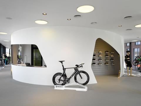
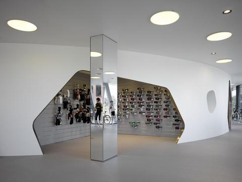
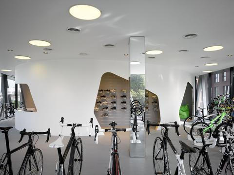
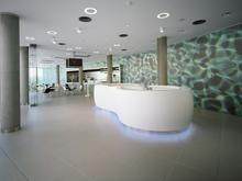
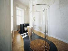
The central task of the design for the new showroom for the Scott corporation was to create a visually strong environment offering both easy orientation for clients as well as a definite workplace calm for employees. The space is conceived as two partially separated sections – the actual display area and the offices of employees with the necessary facilities.
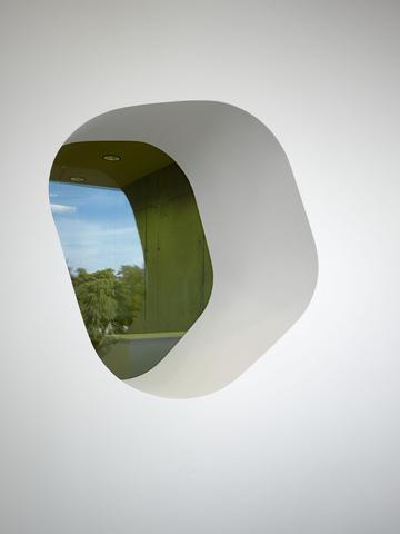
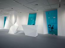
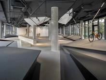
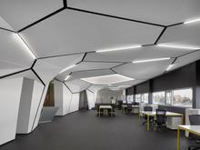
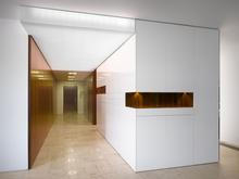
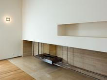
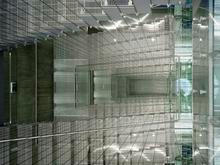
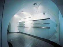
The mass of the slanting white walls brings into the relatively simple space, with its regular window grid and coffered ceiling, a dynamism corresponding with the company philosophy. From the interior of the offices, the “pockets” in the slanted walls are used as storage space with built-in cabinets. Offering contrast to the solid white walls are the inserted glazed partitions of toned glass, creating an airy, delicate impression.
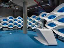
One important conveyor of the overall impression is the colour scheme. In the main sales area, light colours predominate – white walls and the light-grey floor. All of this is supplemented by several sharp cuts of the blue-glass walls, and filtered through them the light-green carpet in the offices.
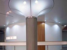
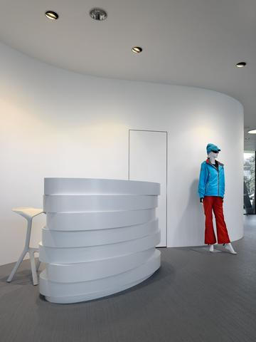
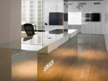
Clients enter the showroom directly from the street. Central to the interior is the sales desk and a column resembling a grouping of white crystals, visually echoing the tilted walls. Part of this space could be put to temporary use for screenings or lectures, with around 20 seats – a screen and projector are built into the ceiling.

.jpg)
